“Look at me! Look at me!“ Strip Poker, Strip Tease, Strip Malls. One is more fun than the other, but each and every one involves exposure.
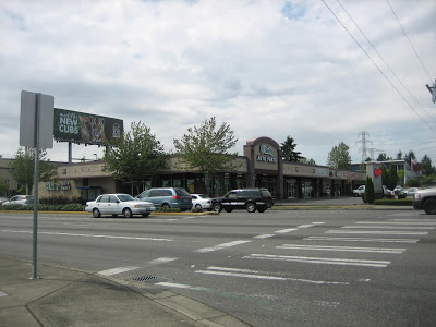
Never in my wildest dreams (or nightmares) did I think I would be choosing colors for a strip mall. But lo and behold, as my destiny unfolded, one day I got a call from a super nice lady in California who manages a strip mall in Federal Way, a suburban community between Seattle and Tacoma, Washington. She liked the projects on my website and asked me to give her a hand with her building that was acutely in need of a face lift.
With my new assignment, my reticular activation system immediately stepped into high gear. All that beige, all that blah, all that American banality that before was just fuzzy visual background noise soon came into sharp focus. I was now staring at, analyzing and even getting excited about strip malls.
Naturally, I wanted to do something groundbreaking, innovative and colorful.
But in reality, as with all color assignments, this wasn't about me. This job was about signage readability, attracting robust businesses and just plain making it look better. So how did I approach it? How did I make it work? Methodically.
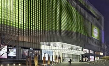
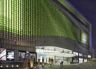
Upon my first site visit I saw an outdated building in sore need of a paint job, competing for attention from neighboring buildings and billboards. I took pictures from near and far, not only of this building, but also of those across the street, of the surrounding bill boards and of the erratic signage.
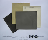
From there I developed four tasteful palettes as potential candidates and sent them off to my client.
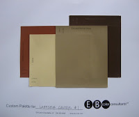
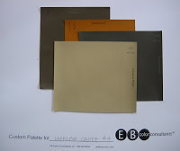

She chose this one. Check. See? I told you I was approaching this methodically.
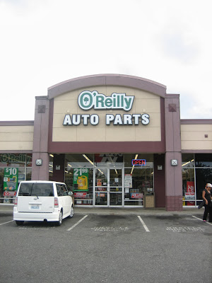
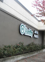
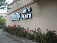
It is very easy to choose a harmonious color palette, but assigning the colors to the elements of the building creates a challenge. There are many different objectives to consider; balance rhythm, sign readability and cohesiveness of signage. This particular strip mall did not have consistent signage - green and white for the auto parts store ,
while the loan company advertised in blue and orange.
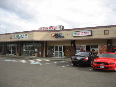
The others were in red.
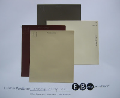
So this was how the colors were assigned and why. The columns, side walls and trim pieces of the building are SW 7026 “Griffin”. Now the white and green sign flanking the highway is now clearly visible against its dark background.
The band that wraps around the top received SW 6119 "Antique White", a warm off-white that can support the diversity of signage color and styles.
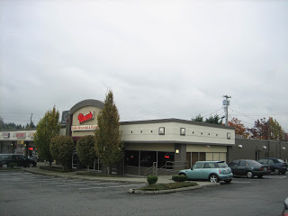
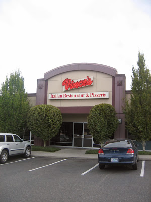
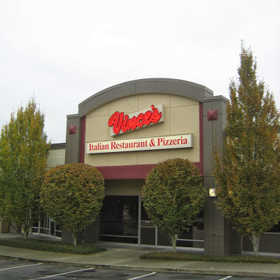
Since Vince’s Restaurant is the backbone of the mall, anchoring the other buildings, it deserved a special treatment. In order to call attention, SW 2802 “Rookwood Red” lines the sign, while SW 6119 “Macadamia” retreats into the background of the sign, as well as on the front walls and ceiling. It is now very warm and welcoming.
As an architectural color consultant, I don’t always work in such a linear fashion. Many of you who have worked with me in the past know how a consultation is often likened to making a painting or writing some music. We try this and we try that. Often, once a new color is introduced to the mix, something from the previous selection might no longer work. It’s not before the final moments until it’s resolved.
Whether you want some help planning the colors of your home, business, apartment complex or even a strip mall, I am at your service.
Elizabeth Brown 206-353-0454 ebrown@eb-color.com