Press
How to Add Color to Your Home
It might be gray nine months out of the year, but that’s no reason to keep it safe and neutral when rethinking paint in your home. Going colorful doesn’t mean painting the whole living room rose quartz and serenity, the 2016 Pantone Color of the Year. A little goes a long way if you follow these tips from three local color experts.
Source: http://www.seattlemet.com/articles/2016/2/15/how-to-add-color-to-your-home
Choose a Dominant Theme
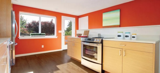
“There’s no sense having a bazillion colors in the house,” says Elizabeth Brown, so choose one dominant color as a leitmotif, then add darks and accents from room to room. Lately she’s seen homeowners going with lighter off-white palettes over more saturated hues, then adding greens, oranges, and turquoises. Where these colors appear needs to make sense, though. An accent wall should be used to break up a room, direct the eye, or create a natural pathway through a space. A bright backsplash remains one of Brown’s favorite places to brighten up an otherwise neutral kitchen or bathroom.
Sunlight Is Everything
When picking a color, always take into account from which direction a room receives sun and test the paint at different times of day. Elizabeth Brown doesn’t even offer online color consultations because “it’s important to be in the space and see how the natural light is working.” Light from the east can be harsh and bring out surprising undertones, perhaps an unexpected green in a color that looked more neutral on the swatch. Westward-facing windows let in warm sunlight, like a saturating photo filter. Brown contends that the safest light, or light that reveals true and intended color, is northern light.
Blue Affects the Brain
While an individual’s emotional reaction to color depends on many variables, including personal memory and culture, certain colors do influence the body’s inner mechanisms. Mehlika Inanici warns against using blues in any room meant for sleep, as blue light suppresses melatonin production in the body and can make it difficult to wind down (looking at laptops and phones before bedtime is discouraged for this same reason). Blue is then a great color for an office, workout corner, or anywhere else you want to stay alert.
It’s Not Just About Wall Color
In his art, and his job as a home painter, Justin Duffus often places certain colors next to each other in order to “trick” the eye and make one hue look different. For a gray wall with purple undertones, accentuate the purple by positioning something yellow next to it. Or mute those undertones with a chair upholstered in bolder purple. Red accentuates green tones, while blue complements hues of orange. Josef Albers wrote the first definitive source of these color relationships with his Interaction of Color. There’s even an iPad app of the book to help experiment with different pairings.
According to the International Association of Color Consultants/Designers (IACC), the right color choices can:
- Improve perception and protect the eyes from unnecessary strain
- Increase efficiency and minimize errors by reducing monotony, irritation and premature fatigue
- Improve orientation and increase safety
And, to some extent, compensate for specific problems such as noise, heat, cold, dryness, and more.
In short, color matters.
DRAB IS THE ENEMY
 “People always worry that going too bright or too bold is the worst thing,” says Beth Burns, owner of Beyond White, a color and finishes consultancy in Virginia. “But to be honest, drab is the enemy, too. It’s not just unattractive; it affects people. They sit in a boring white or builder-beige space and there’s nothing refreshing or cozy; it’s just not inspiring or pleasant to be in.”
And although she’s a color consultant, color is not the first discussion Burns has with clients when starting a new project. Instead, she starts with an analysis and then goals.
“It’s important to understand the existing space and what the goals are for it,” she says. “Is it dark or well lit? Is it hot or cold? Are there lots of separate spaces to be defined or one cohesive area? Do they want the finished space to feel formal and even intimidating or do they want a fun and funky vibe? Ultimately, it’s a combination of what you need to overcome in a space and what effect you want to achieve that drives good color choices.”
COLOR AS AN ORGANIZER
Elizabeth Brown of EB Color Consultants in Seattle, WA agrees. “Without a doubt, bland is bad. But so is color just for the sake of color,” she says. Brown likes to use color with purpose.
As she explains, “Color is great for organizing and anchoring space. Even in an open-concept design, you can use color to define spaces. Say you have a long wall and along it are a copy area and a kitchen. By using a different color in those areas—either on the walls or in the flooring—you give order to the space. That’s very helpful in making people feel settled, calm, and in control.”
Orange for Fun — and Yes, Versatility — Around the House
But when the experts at Pantone chose Tangerine Tango as the Color of the Year for 2012, they gave us a brand-new way of looking at orange. No longer reserved for fall decorations or Halloween festivities, different orange hues can fit into virtually any home. "Folks should give orange another look," says California color consultant Christina Harris. "They may be surprised at how fun and versatile this color can be."
We spoke with Harris and three other color experts around the United States to learn more. Here's their insight on how you can introduce this overlooked color into your home.
Why Is There an Aversion to Orange?
Orange tends to get an instant negative reaction — more so than other colors. "Orange has the ghoulish habit of becoming garish without too much effort," says New York color consultant Debra Kling. Generally, orange elicits a mental image of a bright, gaudy hue. It can get too pink or too yellow very quickly. Plus, its reputation as a Halloween color makes it hard for many to envision incorporating it into their home.
"From the professional side, oranges are tricky," says Harris. "The idea of the 'right' orange changes over time. Even Nike's trademark swoosh is not the same orange year after year. It changes as tastes change about what is the current orange."
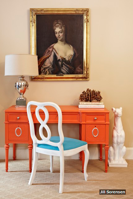
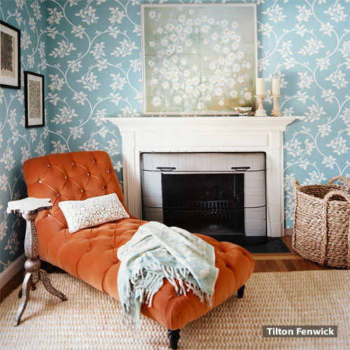
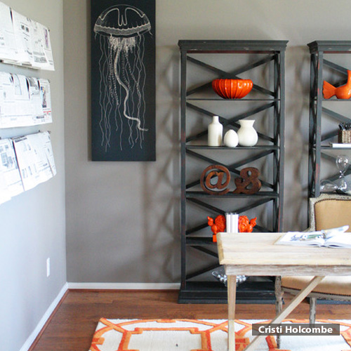
Use Orange as an Accent
Even when muted, orange calls attention to itself. This makes it a great choice for a burst of color on a single wall, piece of furniture or accessory. Massachusetts color consultant Barbara Jacobs suggests using orange for a focal point in a room, and choosing contrasting or complementary colors and textures for the surrounding space.
With the right tone, orange can work with virtually any color. "Hits of orange never disappoint," says Seattle color consultant Elizabeth Brown. "Orange candles, runners and pillows are all great candidates for an easy, affordable way to inject such a wonderful hue into the mix."
How to Transform Your Workspace With Color
![]()
When Serge Longin, founder of RevenueWell, moved the Bannockburn, Ill.-based marketing services company to a new office in 2012, he was eager to transform the bland, all-white office environment. "We wanted to create a space where people were happy coming in to work," says Longin, who previously studied psychology and color theory at the Art Institute of Chicago.
In an effort to visually energize his 25 employees, Longin chose a reddish-orange paint for an accent wall near the hallway. He also strategically placed dark-colored couches and a television against a charcoal-gray wall to establish a subdued area for employees to unwind and disconnect from the daily grind.
Business experts have long espoused the positive psychological effects that color can have on employees in the workplace, ranging from calm, creativity or enthusiasm. Here, we look at how a variety of colors and hues can help transform your office.
1. Red, Orange
Sprinkling small amounts of reds and oranges in an office, such as painting an accent wall or purchasing brightly colored accessories, can create an energetic environment, says Elizabeth Brown, principal of EB Color Consulting in Seattle. “Red is supposed to raise your heart rate,” she says. But use it sparingly, Brown warns, as too much of such a fiery color can evoke aggression and stress. Consider a reddish palette in areas where employees spend only limited time -- such as hallways, bathrooms, or even the kitchen -- where employees are not working, adds Leslie Harrington, executive director at the Color Association, a color consulting firm in New York.
2. Yellow
Businesses using yellows and bright accents can create a sense of happiness for employees who may be bored or unhappy at the office. Psychologically, the color raises self-esteem because it’s often associated with cheerfulness. It’s best to use bright yellows sparingly such as on accent walls, décor or furniture. Too much of these hues – like painting an entire room in neon yellow -- can be agitating, says Mark Woodman, president of the Color Marketing Group, a nonprofit association that forecasts color direction. An exception to the rule is if you’re using a bold color that is part of your logo and you want to increase the presence your brand has in your space. Make sure bold colors are offset by more muted shades. For example, Woodman suggests balancing an intense yellow with light blue or a vivid orange with taupe.
3. Blue, Green
Colors commonly found in nature, such as blues and greens, can have a calming effect on a stressful work environment, says Woodman. Since workers spend most of their days inside fluorescent-lit offices, "any relation to the outside world makes people feel better," he says.
Looking for fresh ideas to grow your business? Consider greening your office with fresh plants or forest-like hues. Research published last year in the Personality and Social Psychology Bulletin found a link between the color green and creativity. Among the study's participants, those who saw a glimpse of green prior to a creative task showed performed better.
4. Pastels
If your office space has few windows or low ceilings, consider pastel colors like peach or lilac when you're ready to paint the walls as a way of brightening the office, says Woodman. Like blues and greens, the softer hues can also be helpful in stressful office environments that require a calming atmosphere.
Whatever color palette you choose, beware of creating too much contrast between the light walls and dark colors of the furniture or decor, says Brown. "Too much contrast creates eyestrain," she says. For example, a black and lilac palette can be jarring and cause visual fatigue. Instead, pair lilac with beige or wood grain.
Customer Story: EB Color Consultants

At a glance: EB Color Consultants
EB Color Consultants specializes in providing architectural color consulting services to homeowners and businesses in the greater Seattle region. By working with Pronto, they successfully realized the value of Internet Presence through a cost-effective, pleasurable process.
Elizabeth Brown
When she’s not turning houses into beautiful homes, Brown loves to frequent her seaside cottage on the Puget Sound where she enjoys gardening and puttering. She says it provides the perfect escape from the hustle and bustle of city life.
Known as Liz to those near and dear to her, Brown is also an avid painter. She paints pictures as a hobby and takes them to market in her Etsy Shop.
The story
“Color makes sense to me…It’s how I relate to the world.” - Elizabeth Brown, Founder and Principal Designer
Elizabeth Brown has always been an artist, a seeker, curious about the world and everything in it. Her childhood, her educational pursuits and her career moves have always revolved around her love of color. And though her life has taken her in diverse directions, it has enabled her to develop the skills needed to specialize in the field she now calls home.
What does she do?
Color.
That’s right. It’s that simple, yet so extraordinarily complex.
Elizabeth Brown is a Color Consultant. She believes in color as a means to transform reality. “Most people don’t realize this, but color affects our daily lives dramatically. It can influence our mood, our thoughts and our actions,” she explained.
As an Architectural Color Consultant, Brown helps people select the right colors for their homes and businesses – colors that reflect the true nature of the people who dwell there. And it is this creative vision that drives the continual engines of her business, EB Color Consultants, every day.
Launched in 2007, EB Color Consultants provides architectural color consulting services for homeowners and businesses in the greater Seattle region. As the Founder and Principal Designer, Brown melds her artistic sensibilities, years of experience, and formal design education to provide expert color direction and exceptional customer service.
“It goes without saying how much I love my job and my business. How lucky I am to use my God given talents and get paid for it! Every consultation is unique and every client is a new puzzle, a new portrait to discover. My customers are lovely and I find myself in all different sorts of homes and businesses. Each job feels like a mini road trip. And since I’m a girl that needs to be moving most of the time, this is ideal”.
The inspirations
“Nature, soul searching, life experience, a lot of work with people from all over the spectrum” are just a few of the ways Brown stays inspired. “And it sure helps to be naturally attuned or brain wired for the process,” she adds. But as a business owner, Brown also identifies the importance of listening to the client as a vital ingredient for success.
“‘How do you want to feel?’ As a Color Consultant, that’s the first question I ask my clients. Once I know that, I can start using color to support it. Color is a sensory perception and everybody has their own unique relationship with it. During our collaboration to develop their color palette, I intuitively draw out of them the colors they desire.”
Professionally speaking, Brown has a Certificate in Interior Architecture and Design from U.C. Berkeley, Extension, San Francisco, CA. Though her program of study was geared more towards large commercial projects, her style is more personal and individual. “I took my extensive training and honed my expertise towards smaller projects and more personalized endeavors,” as she puts it. She furthered her color education with training through The International Association of Color Consultants, an organization that focuses on the human response to color in the built environment.
Today, EB Color continues to grow and thrive with hundreds of loyal customers who call on Brown to create a space that is uniquely theirs. This is because she understands color, and she understands people. “Many people cannot visualize a space or see color, many are overwhelmed and some just don’t have a clue! I help them to corral their ideas, discover what they want, and make it work. It’s very personal and very fun.”
Pronto as a partner
EB Color has been a customer of Pronto since 2011.
When asked how Pronto has helped her business, Brown said, “Huge! My business has been growing every year as I earn referrals and repeat business, but after I signed up with Pronto in August of 2011, I took my business to a whole new level.”
She further added, “With the implementation of their effectual SEO, the phone started to ring at an accelerated rate. I’m always on top in the Google rankings for my category. The professional website they custom designed for me really showcases my portfolio which is essential in my type of business. I’ve had many clients say it was my website that was the clincher to call me.”
How has your experience with Pronto been?
“I have to say, it’s been nothing short of amazing. The support team is prompt, courteous, and thorough with their follow-up with each of my requests.”
Would you recommend Pronto to others?
“Yes! Pronto opened doors for me and helped me reach clients that I wouldn’t have met and worked with otherwise.”
You must be logged in to post a comment.