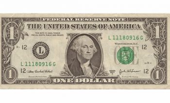
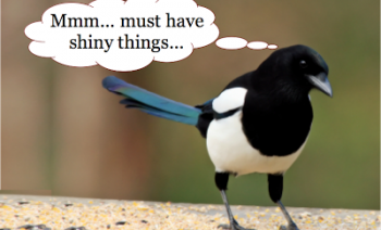
As we all celebrate our inner leprechaun tomorrow, perhaps to raise a glass of Guinness or to dance an Irish jig, here is a post in the spirit of ...
Blog
https://www.eb-color.com
EB Color
ELIZABETH BROWN
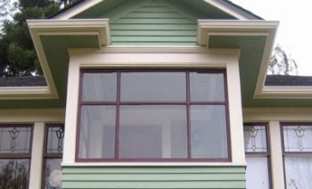
Seeing Green
https://www.eb-color.com
EB Color
ELIZABETH BROWN
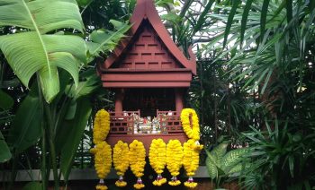
The Spirit House- Each a Singular Sensation
People wanting to put their own stamp on their place call EB Color for help. In fact, many of the homes started out as mere cookie cutter boxes drenched ...
https://www.eb-color.com
EB Color
ELIZABETH BROWN
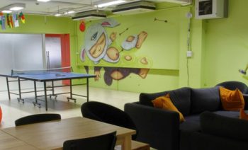
Lively Up Your Office!
Do you often wish that your office environment was not dull and mundane? Do white walls dampen the spirits of your employees, stinking up the place in ...
https://www.eb-color.com
EB Color
ELIZABETH BROWN
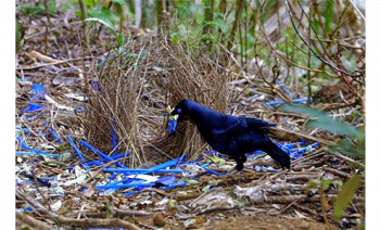
If You Color It They Will Come
The courtship behavior of Bower Birds has always fascinated me.
Image source
These crafty, clever avian creatures in Australia erect elaborate ...
https://www.eb-color.com
EB Color
ELIZABETH BROWN
Exterior Colors Not to Reason Why
People come to EB Color (that would be me) because they are planning to paint their house and want it to look great. It is understandable that one would ...
https://www.eb-color.com
EB Color
ELIZABETH BROWN
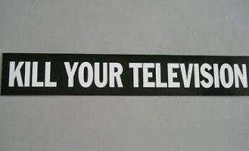
Kill Your Television
I'm kidding. But I did have that bumper sticker back in the day. As you know I've been preaching the gospel of hiding the television into its background. ...
https://www.eb-color.com
EB Color
ELIZABETH BROWN
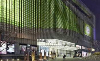
Exposed! New Color for a Strip Mall
“Look at me! Look at me!“ Strip Poker, Strip Tease, Strip Malls. One is more fun than the other, but each and every one involves exposure.
https://www.eb-color.com
EB Color
ELIZABETH BROWN
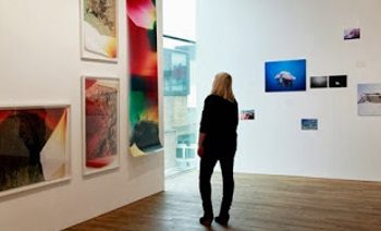
Finally! Artwork You Can Afford
I write this post from a coffee shop with ”black hole” as the Wi-Fi password and I’m hoping not to fall in. But tumbling into a white hole…that’s ...
https://www.eb-color.com
EB Color
ELIZABETH BROWN
Meet the Sheens… A Glossy Tale
Once upon a time there was a family who lived in a paint can whose children were named Flat, Matte, Eggshell, Satin, Semi-gloss and High Gloss....
https://www.eb-color.com
EB Color
ELIZABETH BROWN
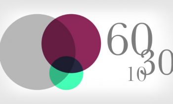
60-30-10 Rule
There is a rule in design that we often follow called the 60-30-10 Rule. This means, in devising a three color palette you would use 60% of one color.... ...
https://www.eb-color.com
EB Color
ELIZABETH BROWN
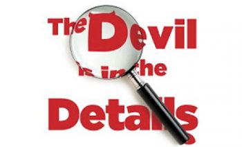
The Devil is in the Details
People around Seattle call me because they know I can help them make their house look much better. Sure, I can help them pick the right hue....
https://www.eb-color.com
EB Color
ELIZABETH BROWN
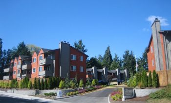
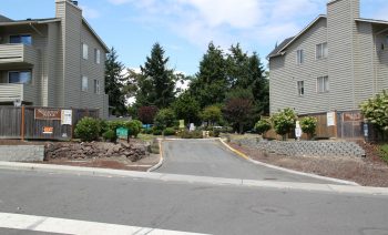
Bringing an Apartment Complex to Life
One of my colossal projects last year was the coloration of a large apartment complex, The Courtyard at South Station , situated in Tukwila, WA, just ...
https://www.eb-color.com
EB Color
ELIZABETH BROWN
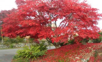
Bittersweet
It’s September 21, 2012, the first official day of autumn. Recently I was concurring with an English pen pal that with the onset of fall, a melancholy ...
https://www.eb-color.com
EB Color
ELIZABETH BROWN
Working at the Speed of Light
Yikes! I haven't posted since January. I feel like Rip Van Winkle waking from miraculous slumber
https://www.eb-color.com
EB Color
ELIZABETH BROWN
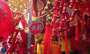
Year of the Dragon
Happy New Year! Chinese New Year that is…”The Year of the Dragon”. It ’s time to get your red on! Why? The color red symbolizes fire and is said ...
https://www.eb-color.com
EB Color
ELIZABETH BROWN
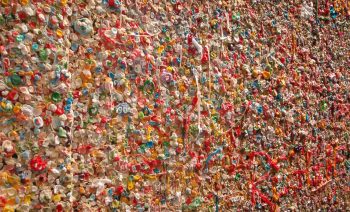
Decorate Your Walls With Gum!
Now that I have your attention…the famous gum wall at Pike’s Market in Seattle is indeed colorful, but maybe not how you want to dress yours. However, ...