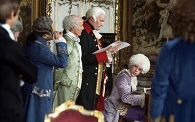
Emperor Joseph II: Occasionally it seems to have…too many notes.
Mozart: I don’t understand. There are just as many notes as I require, neither more nor less.
Emperor Joseph II: My dear fellow, there are in fact only so many notes the ear can hear in an evening. Don’t take it too hard. Your work is ingenious. It’s quality work. And there are simply too many notes, that’s all. Just cut a few and it will be perfect.
Mozart: Which few did you have in mind, Majesty?
This memorable passage from the movie Amadeus reminds me of several color consultations I’ve been on recently. In the instance of Mozart’s piece, every note made beautiful sense, yet in regard to these exteriors, this is not the case.
Here, indeed, there are just too many notes! On recent exterior color consultations, I’ve encountered pure visual cacophony -too many competing elements. The eye doesn’t know where to rest. Thank goodness for paint as it can help to edit the composition and camouflage superfluous or glaring elements.

Let’s take a look at the example above. I was called on this project by the owner, who was well aware there are “just too many notes”. Nine different competing colors comprise this composition which also exhibits a myriad of textures and values; roof, gutters, trim, window sashes, garage doors, stone work, stucco body (two colors here), front steps and iron work. There was even another color on the side. Your eyes are in perpetual motion as each element screams out “look at ME, look at ME!” like a spoiled child whose has too much sugar. (In this case chocolate.)
What did we decide to do? Well, eliminate about half the colors for one. The white window sashes, the roof and stone work were the only ”givens” we could not change. Not only that, they served as a point of departure for developing the palette. We chose SW 7038 “Tony Taupe” for the entire body. It melded nicely with the stone and front steps. We used the same color for the garage doors, but upped the ante on them with a double formula, so it would not appear too homogeneous.

 Photo by Elizabeth Brown
To create a continuous line, the same color, SW 7047 “Porpoise” was specified for the trim, fascia and gutters.


I will share the “after photos when they become available.
Students who undergo training through the IACCNA have to complete an assignment called “Over and Under”. In this exercise one must take an image and manipulate it with color to take it one step “over stimulated”, one step “under stimulated” and finally “just right.” There is a very delicate balance. For me, this was an invaluable lesson in training my eyes and sensibilities.
So now, if I may quote Emperor Joseph II, “Just cut a few and it will be perfect."
206-353-0454
ebrown@eb-color.com
Leave a comment!
You must be logged in to post a comment.