
People around Seattle call me because they know I can help them make their house look much better. Sure, I can help them pick the right hue, but as in the saying “the devil is in the details” sometimes an exorcism is in order.
Many of you know that I am a big fan of editing – you know, the extraneous details on structures that serve no function structurally and diminish the architectural integrity of the building. Too often, there is just too much trim and worse yet, it’s painted out for contrast creating a very busy impression. I addressed this in a former post “Too Many Notes”.
Well, how to call it? When to paint the trim for accent and when to camouflage? Well, without sounding too evasive, the answer is “it depends”. And upon what, you ask, does it depend ? Well, duh…the situation! In one of my color seminars through the IACCNA we were given an assignment called “Overstimulated vs. Under stimulated”. Through the use of color and its placement within the space we aimed to achieve a perfect visual balance of elements. Both under stimulation and over stimulation can be visually fatiguing. It was valuable lesson to learn and I have taken it to heart when tackling exteriors.
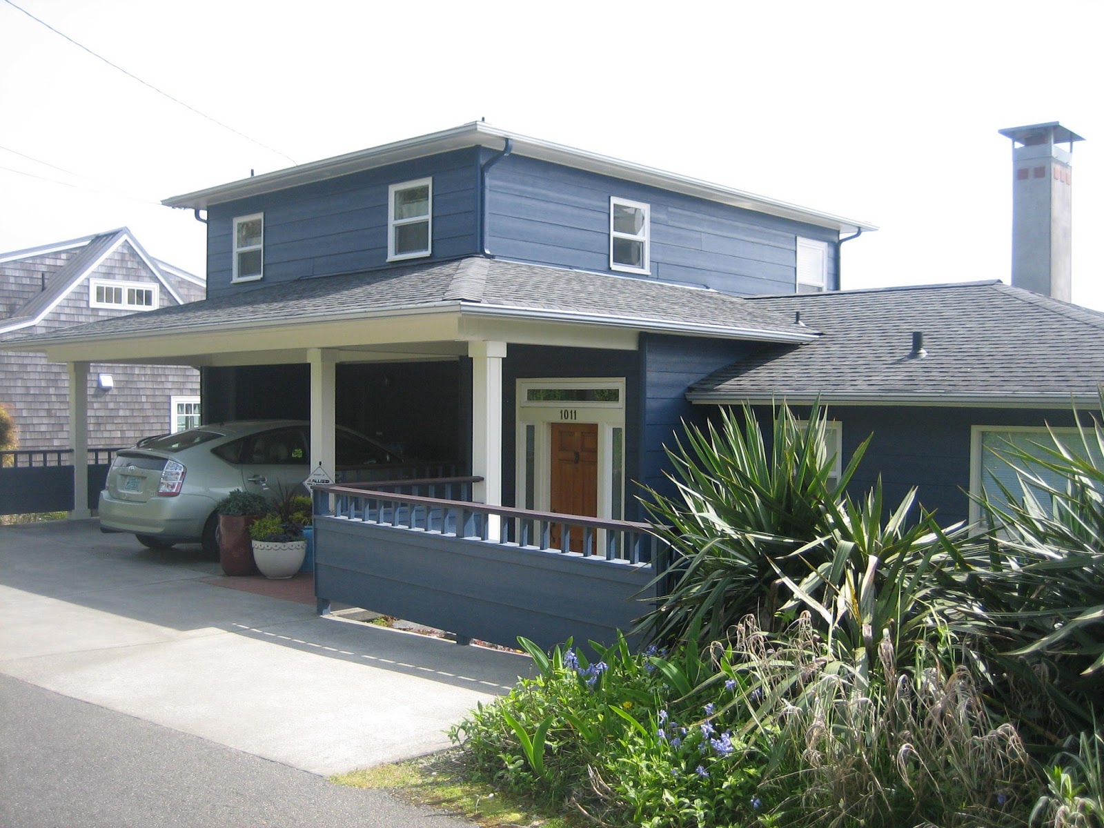
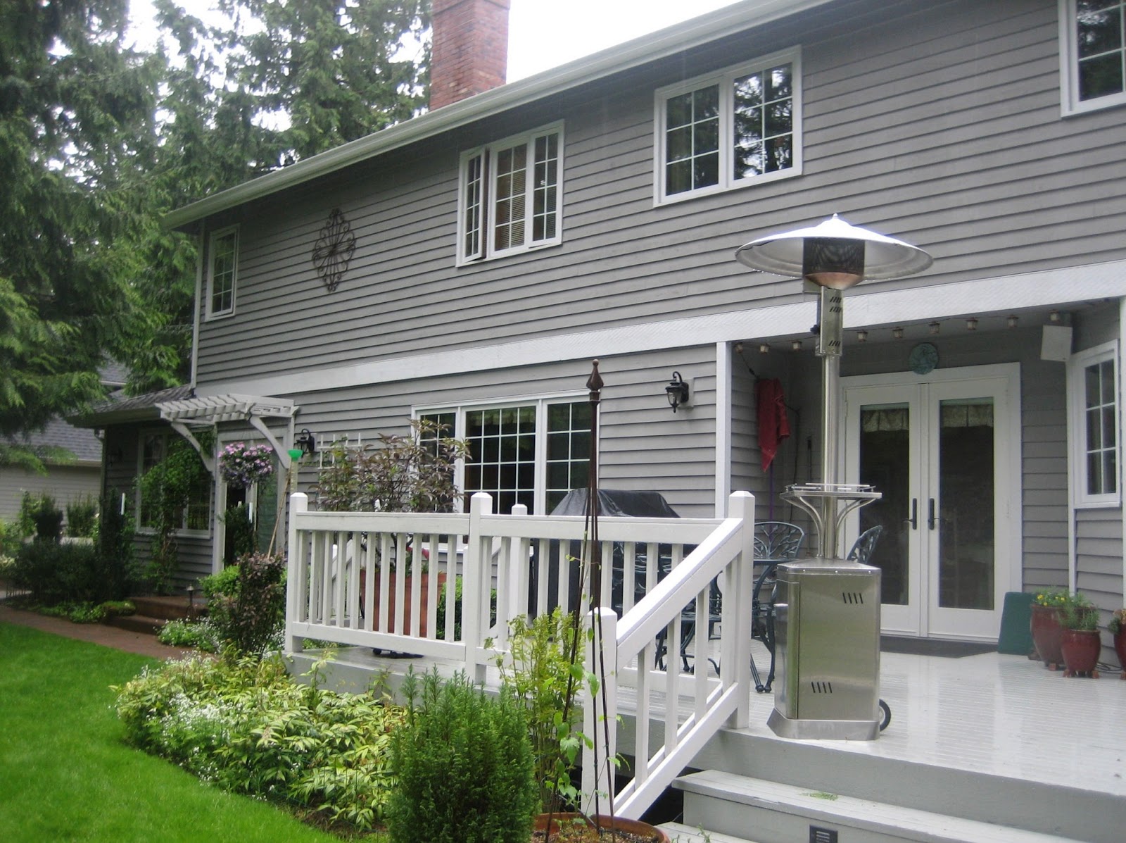
So let’s look at some projects where the unnecessary was eliminated. Here’s example No.one. When examining all the elements on this home, I suggested that the vertical trim be painted out the same as the body. It detracted from the beauty of the entry with stately columns flanking a lacquered front door. The homeowner started to finally notice and said his house looked like pinstripes.
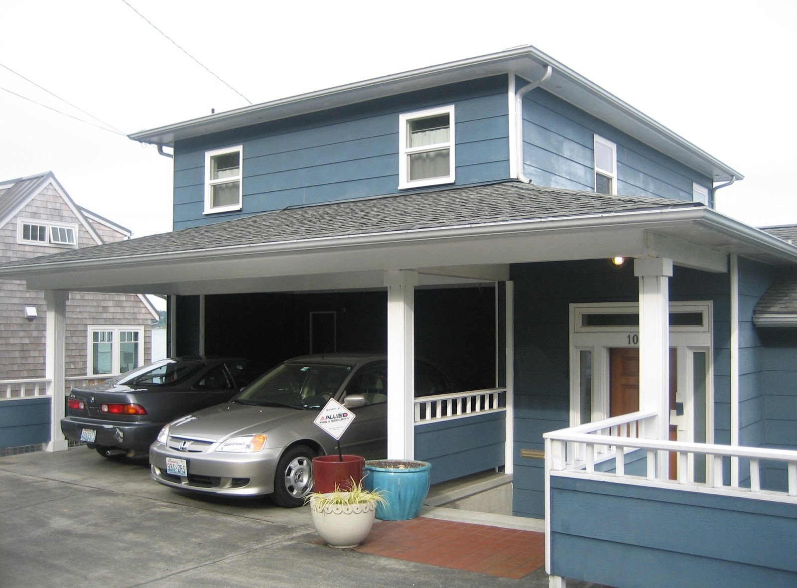
In addition the decorative rail pieces were too much – it diminished the curb appeal.
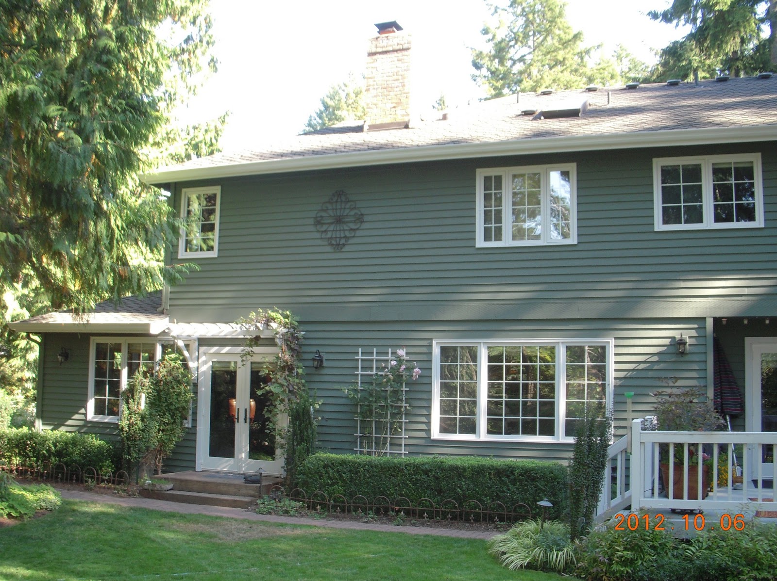
By painting out the vertical trim in the body color and assigning a deep burgundy color (custom color to match the leaves of their Smoke bush ) to the top of the railings, the entry is now grand
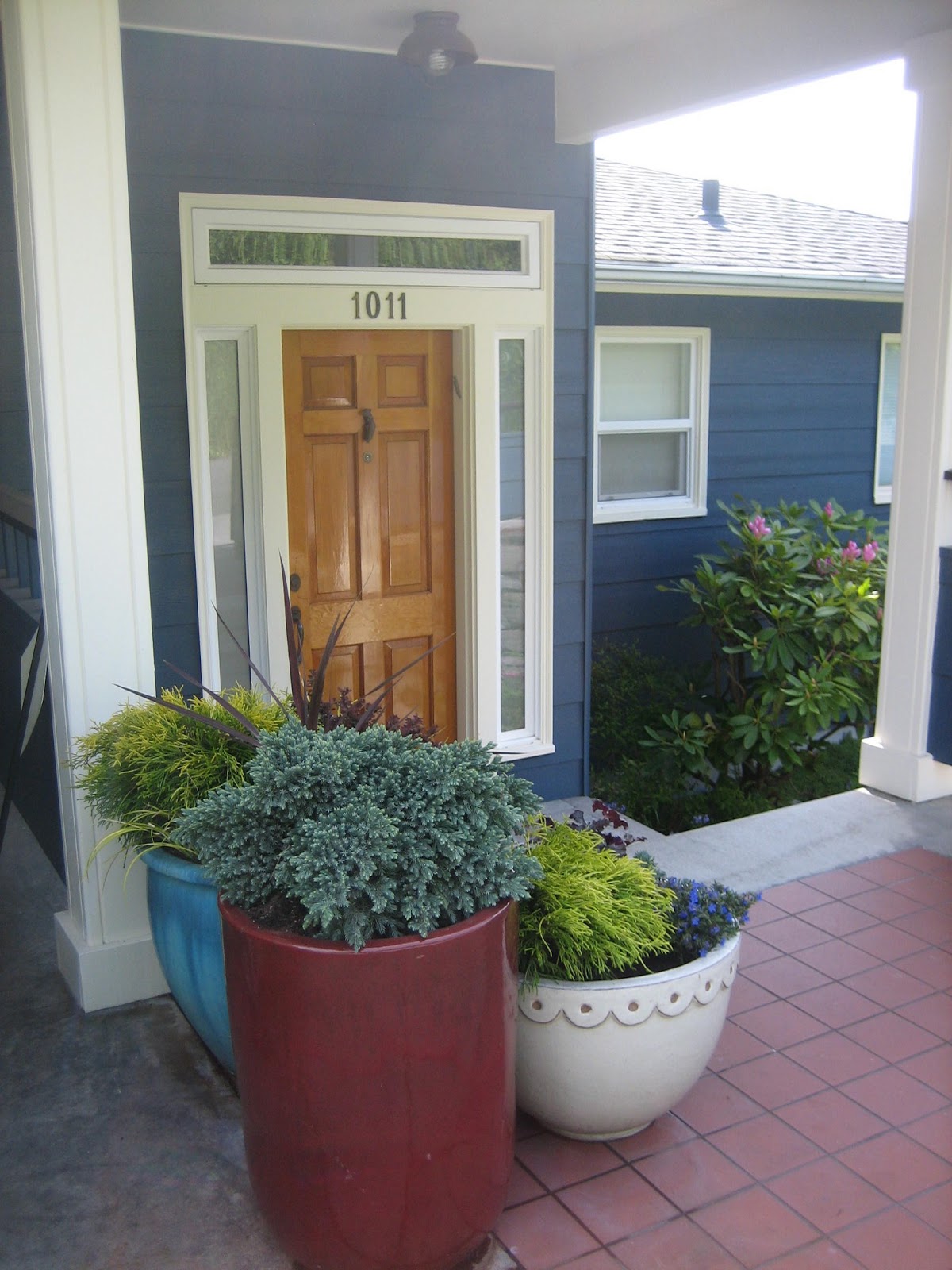
and the entire house now works together with cool rich color (BM HC-155 Newburyport Blue) complemented with the warmth of off white BM OC-115 “Cream Silk”.
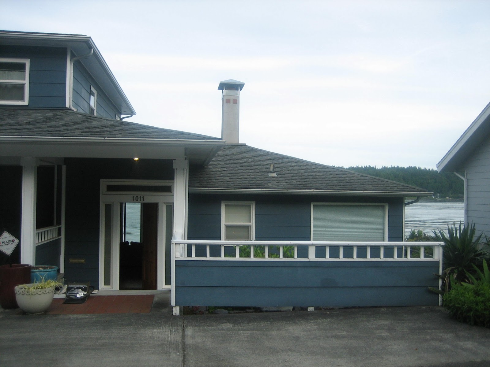
Here is another example where editing made a vast improvement. The horizontal belly band was a distraction, serving no real function.
Now that it is painted out in Sherwin Williams SW 6187 “Rosemary”, notice the beauty of the contrast of the windows, no longer competing for center stage.
In the final example, I’m going to show you one of my pet peeves – vertical trim on bay windows that extend from the windows proper and span the entire wall.
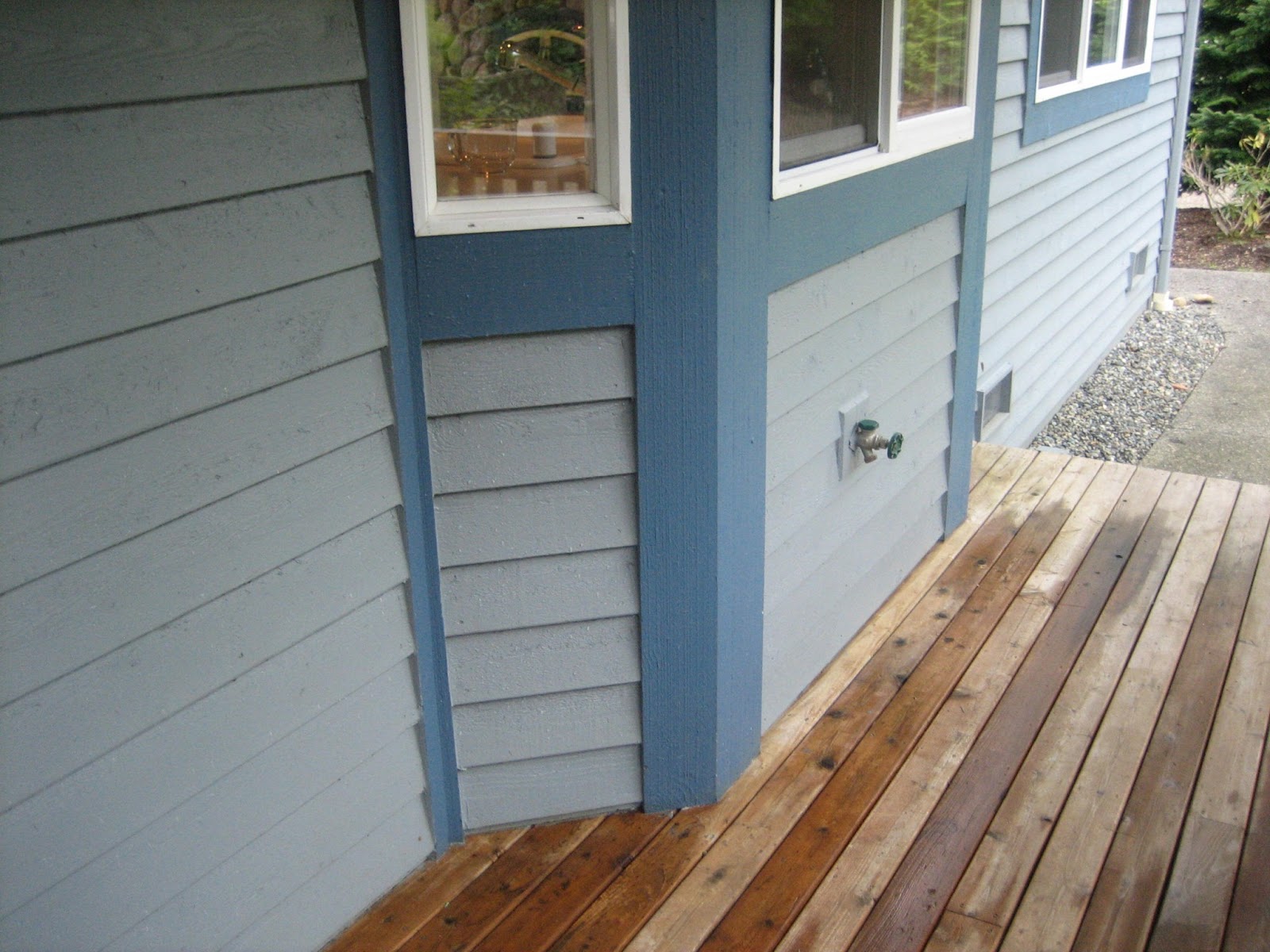
It is so sloppy,
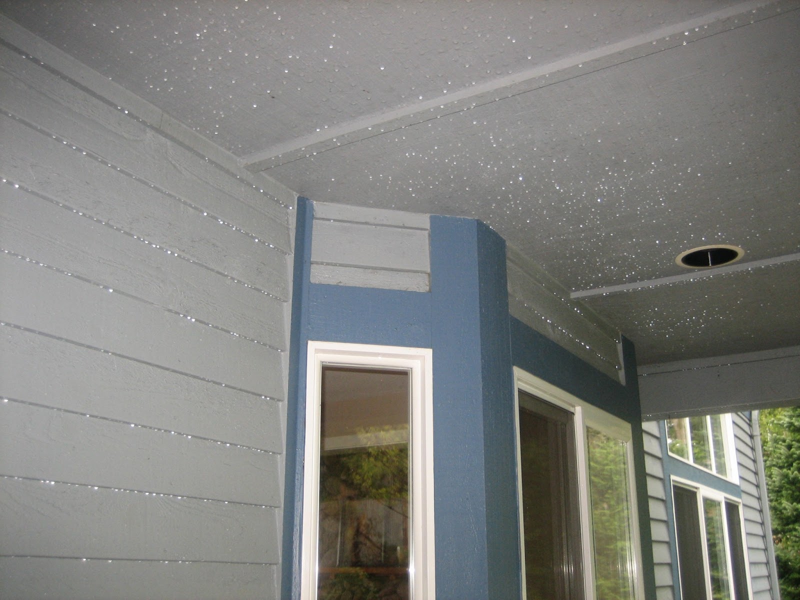
…and my belly band nemesis once again.
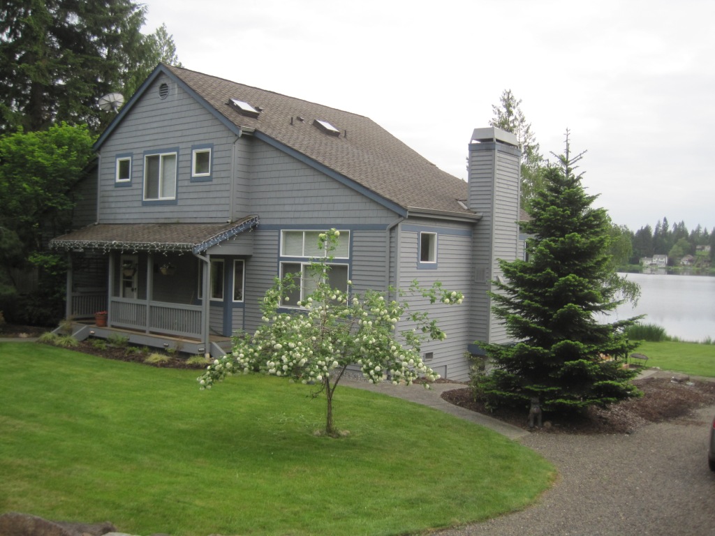
On this exterior we created a false line around the window creating a clean break with paint (AF-80 "Jute"). We also edited the belly band. Now it it’s clean and crisp, awash in Benjamin Moore's AF-105 "Elk horn". .

In closing, here are some parting words. It goes without saying that you should always camouflage the downspouts into the body!
So you see, it’s not just about finding a pretty color. There is so much more that goes into an expert architectural color consultation. And EB Color is here to help.
eb-color.com 206-353-0454 ebrown@eb-color.com
ebcolor
Thanks, Paula. Can’t figure out eh disqus thing to comment.
Subject: Re: New comment posted on The Devil is in the Details
Paula Doelling Lynn
Your explanation and examples are impeccable!! Loved this post, EB!!