

Since I had never consulted for a law firm, I did a little homework in advance. I researched other law firm design and found the typical paneled walls, red leather seats and other ubiquitous clichés. One can practically smell the cigar smoke. So how to proceed? Well, one look at their logo and it was obvious. Their colors were quite nice, a rich terra cotta, dark greenish gray and a deep brick red. These colors would lend themselves to an interior palette and we’d do the “branding” thing while we were at it.

In this project we were limited to using Sherwin Williams paint because that is what the contractor implicitly stated in the finish schedule. No problem, there are colorful solutions to be found in their architectural kit, and I have always particularly loved their Preservation Palette. Before I arrived, I matched them up with Roycroft Pewter, Rookwood Red and Rookwood Terra Cotta. The combination of these colors was exquisite and my client thought so too. Voila…a starting place. The other given was a carpet sample, already chosen by the owner in which interestingly enough, all of these colors were inter woven.


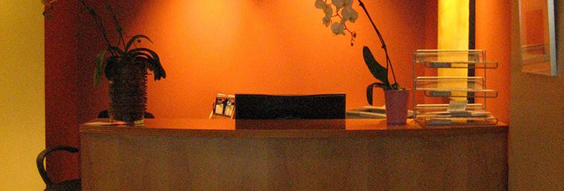
The only places where it worked to put the terra cotta were the walls at the end of the hallway and the wall kitty-corner to that. It would inject some color in nondescript areas.

The window sashes were already burgundy aluminum, so that took care of that color, and we used a mid tone gray laminate counter tops in work areas. Not exciting, no, but it rounded it out the palette creating the necessary warm/cool balance as well as serving as a visually ergonomic work surface.

It was a very successful installation and a pleasure to tour its completion as well as to view their impressive art collection.

A huge thanks to Nedra Daly, over at Daly’s Paint, my all time favorite paint store, for referring me for this great job. They are dealers in C-2 and Pratt and Lambert and top of the line stain products.
If you need an expert color consultation, please call me or email EB Color Consultants and together we’ll get it right.
Elizabeth Brown 206-353-0454 ebrown@eb-color.com
Leave a comment!
You must be logged in to post a comment.